Design reference to production portfolio
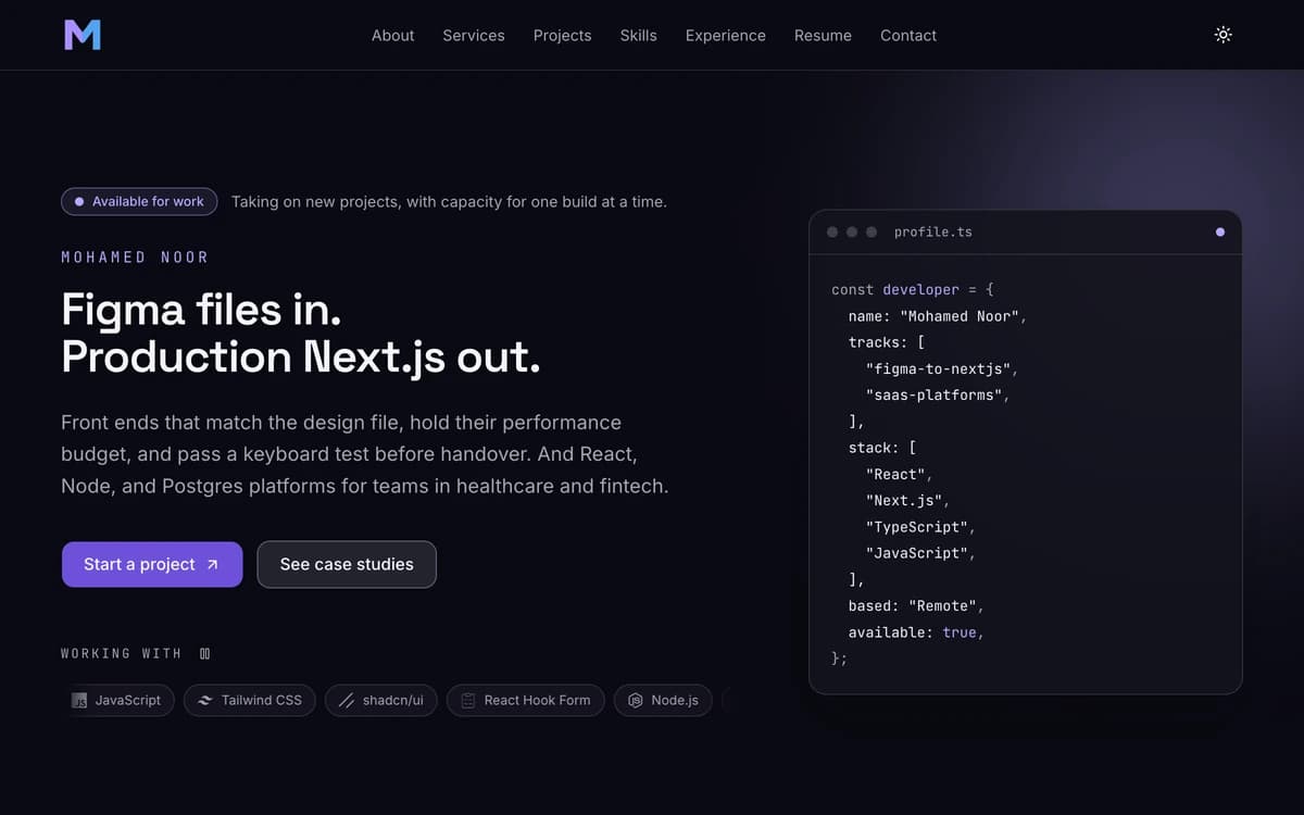
This site. Built from a design reference to a measured accessibility and performance standard, with the parts of the reference that would have been dishonest deliberately removed.
- Role
- Sole developer
- Period
- 2026
- Stack
- Next.js
- React
- TypeScript
- Tailwind CSS
- shadcn/ui
- Motion
- Vitest
Measured
100/100
Lighthouse accessibility
Mobile preset against a production build, scored on the home page, a case study and the contact form.
0
axe violations
Every route in both themes, including the mobile menu open and the contact form showing its errors.
108 ms
Largest Contentful Paint
Measured in a real browser at mobile viewport, with cumulative layout shift at 0.
Problem
A developer with no reviews has to win work on evidence alone, and most portfolios actively work against that. They lead with a generic tagline, rate their own skills with percentage bars, and show screenshots with no account of what was solved. A client cannot tell a capable developer from a template.
The reference design I started from had that problem built in. It carried a client-count statistic and a satisfaction score, neither of which could be true for an account with no completed jobs, and skill bars that are self-assigned by definition.
Approach
I matched the reference where it was good and departed from it where it would have made the site lie. The palette, the hero composition, the eyebrow-and-heading rhythm and the card language were kept. The invented statistics and the skill percentages came out and were replaced with numbers that carry the measurement behind them.
Because accessibility and performance are services this site sells, they were treated as build gates rather than aspirations. Contrast is not reviewed by eye; it is a test that converts every theme token from oklch to sRGB and fails the build if a pair drops below its WCAG threshold.
- Every proof point on the site names the measurement it came from
- Colour contrast is a test, asserted across fourteen token pairs in both themes
- A production build is refused while any project is still seeded example content
- The design reference was followed, not copied: three elements were removed on purpose
Architecture
Next.js App Router with server components throughout. Every route is statically generated and the only server work is the contact form's Server Action, which re-validates with the same Zod schema the browser used rather than trusting what arrived.
All copy lives in typed content modules with invariants checked at module scope, so a malformed entry fails the build instead of rendering an empty section. Client components are limited to the five islands that genuinely need them: the theme toggle, mobile navigation, contact form, project filter, and the marquee's pause control.
- Static generation for every route, verified in the build output
- Security headers including a Content Security Policy, served without middleware so routes stay static
- Social images generated at build time from the content layer
- 297 tests over the logic that can be wrong: validation, contrast, metadata, structured data
Outcome
Lighthouse accessibility, best practices and SEO all score 100 on the mobile preset, axe reports no violations on any route in either theme, and layout shift is zero.
Performance measured 92 to 97 on the same runs, which is below the 95 target on two of the three routes. The cause is recorded rather than glossed: with simulated Slow 4G, roughly 425 KB of critical path costs about 2.9 seconds of render delay, while the same page reaches its largest contentful paint in 108 ms on a real connection. Reporting only the flattering half of that would undercut the point of the site.